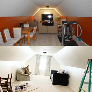
So excited to be revamping the house one room at a time and making it my own. After the laundry, I considered skipping around and decided that I was going to work through the house in order instead. We had already painted the main living room and kitchen, so after the laundry room makeover I moved upstairs to our bonus room. It sits over our three car garage and is very long, making it some what of an awkward space. It would make a good game room or playroom for children. Im considering mimicking it after a studio apartment except I plan on doing matching twin beds and a sitting area. But first, I have to get rid of the awful dark red paint.

This picture was included in the photos they listed to sale the home. The photo makes it appear smaller because of all of the stuff, but it's huge. Once it was cleared out, the red walls gave the illusion that the ceiling was lower because of the slant. Every time I walked in there I felt like it was long but small at the same time. That wasn't the case at all and I wanted to open it back up to feel like the spacious room it actually was. I decided to go with Behr Swiss coffee in satin and paint the wall and slanted ceiling wall the same finish to give the illusion that the angle wasn't there or as dramatic making the room feel taller and wider.

It took two coats of Kilz primer and the rest of the two gallons that we had to cover the red before I was able to go over it with the Swiss Coffee. I double coated the paint color and you can see in this photo the difference between the first coat and second coat when I was in the processing of painting the Kilz.

This was after the first coat of Swiss Coffee on the top and bottom of the side walls. You can see where we started to pull off the wallpaper on the end wall. Ive never dealt with removing wall paper before, so that was a bit challenging. We ended up pulling it off and using hot soapy water and sanding to remove the leftover residue. You can see the process in the pictures below.
I finished off the room with painting the ceiling in the same color as the walls but in flat. It really brightened up the entire room and made it all cohesive. The previous owners left their couch in there and we added our daybed and matching curtains, but we've yet to decide on an official purpose for this room. We'll have to wait and see what works best, but until then, Im loving this makeover! Here are the finished photos.
I would like to try and get a better photo of the after in this room. Ive found that with all of the shadows from the lack of lighting it's hard to get a good photo. We have added new inset lighting in several of the rooms in the house, but we haven't tackled the lighting in this room yet due to it being an extra area. I would love double lanterns, but we'll see. Until then, on to the next project..


